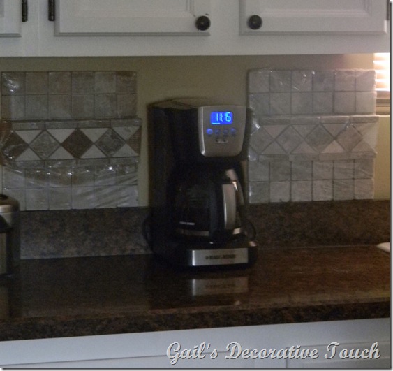
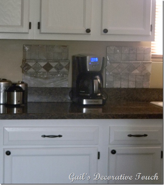
To all my wonderful family and friends I need your help! Charlie and I are going to be putting in a backsplash in the kitchen and I can’t decide which one I like best. (Sorry for the quality of the pictures but it was hard to get a good picture because the tile squares has plastic on them.)
Which one would you go with…..the one on the left or the one of the right?
I’m leaning more towards the one on the left!
Left One
On last look.
Which one did you like?
Gail
P.S. I’m linking to Wednesday’s Linky Parties and they are We Are That Family for Works for Me Wednesday, Someday Crafts for Whatever Goes Wednesdays, Blue Cricket Design for Show and Tell and Me and My Bucket for Show Us What You’re Workin’ With.


I would do the one on the left. When I seen the first picture I had already decided to do the one on the left!!!
ReplyDeleteAsh
left one. Or... I'd pick the one that costs less money...or do I pick the one chosen by my honey...he would work on it like he was on a mission...but then again, I need to consider his heart condition...
ReplyDeleteI would go with the one on the left. It stands out nicely and yet is not too busy looking. It matches/compliments better than the plain one.
ReplyDeleteLEFT :) Love it!
ReplyDeleteLeft. Unless you really want a clean white look in there. I think the left ties your countertop and cabinet colors better though.
ReplyDeleteI like the one on the right.
ReplyDeleteBut then I saw the comment right before mine and it said something about the left one looking better with the countertops - and I agree - so now I say Left. :)
Def. the left one
ReplyDeleteI like the one on the right
ReplyDeleteDefinitely the left!! It's a nice transition between the countertop and the cabinets. The one on the right is too light for the white cupboards :)
ReplyDeleteI would be leaning to the left one with the darker in it to match the counter tops.
ReplyDeleteI vote for the one on the left!
ReplyDeletethe right. it would keep the kitchen brighter and airier
ReplyDeleteleft one. good luck. :)
ReplyDeleteThe one on the left. It coordinates well with the counter.
ReplyDeleteI say the one on the left!
ReplyDeleteRonda
This comment has been removed by the author.
ReplyDeleteDefinitely the one on the left! It's going to look fantastic!
ReplyDeleteSuzanne
It is starting to sound a bit redundant, Gail, but definitely the LEFT ONE! I really love it!
ReplyDeleteThe one on the left matches better with your counter top. I do love them both. I would do the right one in my home because I have a white counter top. I say go with the left for your home. They are both very pretty
ReplyDeletedeezie
My pick is the one on the left :) Very pretty choice!
ReplyDeleteI would go with the one on the left because it has both light and dark colors in it, which makes a nice visual transition between the white cabinets and the darker counter. The one on the right right is very pretty, but it makes for a more drastic transition to the counter, rather than gradual.
ReplyDeleteI like the one on the left.
ReplyDeletePat
Looks like the one on the left wins! Glad I liked that one too or I would feel like I had bad taste, although the one on the right is very pretty too!
ReplyDeleteLEFT, LEFT, LEFT. :)
ReplyDeleteGina @ CraftTeaCottage
Hi Gail,
ReplyDeleteI studied it for a while and I think the one on the left seems to fit best.
good luck with your decision. Either one would look wonderful, but there is something I like better about the one on the left:-)
The left is best ;-)
ReplyDeleteI like the darker one. LEFT is the right answer to this question.
ReplyDelete