Happy Friday Everyone! I’m happy to say that I got my computer back. I can’t tell you how much I’ve missed my computer. But I have to admit, I was able to get a lot done without it.
One of the things I finished was painting the downstairs.
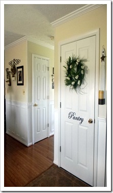
I love this color. It’s called Navajo White by Sherwin Williams.
Pictured below is a before and after.
Originally, my plan was to paint it two shades lighter than what I had on the walls, but I changed my mind and went three shades lighter. I’m so glad I did. The downstairs is much lighter and brighter now.
How do you like my Pantry sign? I made it using my Cricut.
Lastly, I would like to Thank Marie and Liz at Sally Lee by the Sea for featuring my Guest Room. What an honor to be featured in such an inspiring blog.
Thanks for stopping by and have a wonderful weekend.


Looks Great. Love the lighter color. I like the font you used for your Pantry vinyl. Great job.
ReplyDeleteGail I LOVE the new lighter color!! Everything looks wonderful and I love your pantry sign too! Enjoy your weekend, Martina
ReplyDeleteAfter the long winter we had, I am sure lighter and brighter is what the doctor ordered. This looks really good.
ReplyDeleteI love the Navajo White. My house in Scottsdale was painted that color and it is so easy to live with. It just seems to go with everything. Light and airy. Love your pantry sign also. Perfect. Hugs, Marty
ReplyDeleteIt looks so fresh, Gail! I know what you mean about getting more done without the computer. Even though I wasn't blogging, I was still scanning others just to see what was going on!!
ReplyDeleteThanks for stopping by and your nice thoughts!!
Hi Gail,
ReplyDeleteI'm so glad you got your computer back, we get so used to it being a part of our daily lives that we feel strange not having it, don't we!
I love that shade of white, it is beautiful!!! I wish my house was more white than yellow, I'm really tired of the yellow.
I really like your Pantry sign, too, you have been a busy gal!
Have a great weekend too, my friend.
Hugs, Cindy
Looks wonderful, Gail! Love the color!
ReplyDeleteIs that vinyl you used with your cricut on the pantry letters? Or did you make a stencil?
Navajo White is the exact color I use. I have built 3 houses and I use that color every time. Nice work.
ReplyDeleteLaurie
Fabulous job, Gail! Love that Navajo White. Thanks for the mention - we were so happy to feature your divine design :O)
ReplyDeleteDigging the new color! Love your pantry door too, makes a drab door fun!
ReplyDeleteNice color, Gail! I like it both colors, but I can totally understand about wanting a change. Love your "pantry" sign!
ReplyDeleteHey Gail...glad you are up and running. I imagine without the distraction of blogging one could really accomplish a lot! Your hallway is wonderful. So clean and fresh. I plan to paint mine on my summer break. I just can't get to it before then...your pantry door looks awesome! ~Ann
ReplyDeleteVery, very pretty and so fresh looking. Love the lettering you did with your Cricut. I'd be completely lost without my laptop, but I'd sure get more accomplished around here! Good to know all is well again.
ReplyDeleteGorgeous wall color! I love your "Pantry" sign. I wish I had a Cricut. *sigh* Oh well, maybe someday! LOL! Enjoy your weekend!
ReplyDeleteLove the new color & the pantry sign! I'll have to try it on my Cricut;)
ReplyDeleteI've never cut vinyl, is it hard?
Warm Weekend Wishes,
Jodie
Love it, Gail! So lovely and your pantry door looks great!
ReplyDeletebe a sweetie,
Shelia ;)
Love your new paint color. It's the time of year for light and bright. The great thing about lighter walls is you can always go light and dark with accessories to change the look. I've been out of town so just catching up on blogging myself. Really enjoyed browsing back through your blog. The mantel headboard in your guest room is amazing! Everything is lovely!
ReplyDeletePretty... I think the colors look so nice together and I love the decorations on the wall.
ReplyDeleteI love the new color it all looks so fresh and bright...But I couldn't stop looking at the wreath on your pantry door..I so love the wispyness of it and it is different...Have a wonderful weekend. Hugs,Jolyn
ReplyDeleteIt really looks great! Cute pantry sign too!
ReplyDeleteYour walls look great...love the color. I have a Cricut but hardly ever use it. Didn't realize when I bought it how expensive the little thingamajigs that go with were going to be. By the way, which one is that? I love the font!
ReplyDeleteHi Gail,
ReplyDeleteWhat a gorgeous home! The color looks wonderful. Thanks for letting us know the make and color. I really want to lighten up my dining room and kitchen and I like when I hear someone has used a paint color and loved it.
I love the Pantry sign too. I've got to use my Cricut more!
Jane
Gail, what color did you use on the trim and the below the chair rail?
ReplyDeleteVeronica